
Improving ease of use and the overall user experience of our control panel is an ongoing effort for the product design team, and we take our customers’ opinions into account. Over the past few months, we’ve rolled out a series of design improvements focused on text readability, easing eye-strain, and providing a seamless brand experience.
In making these changes, we considered customer feedback about the use of red, on-screen legibility, and alignment with our brand style. We also worked closely with our brand design partners in marketing to create a more consistent experience for our customers with a common design language.
What was changed?
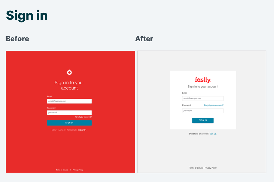
The older style of red navigation and sign in screens were a sore spot for customers. While red is a core brand color for Fastly, the visually demanding, full-bleed, red background was called out as harsh and hard to look at.
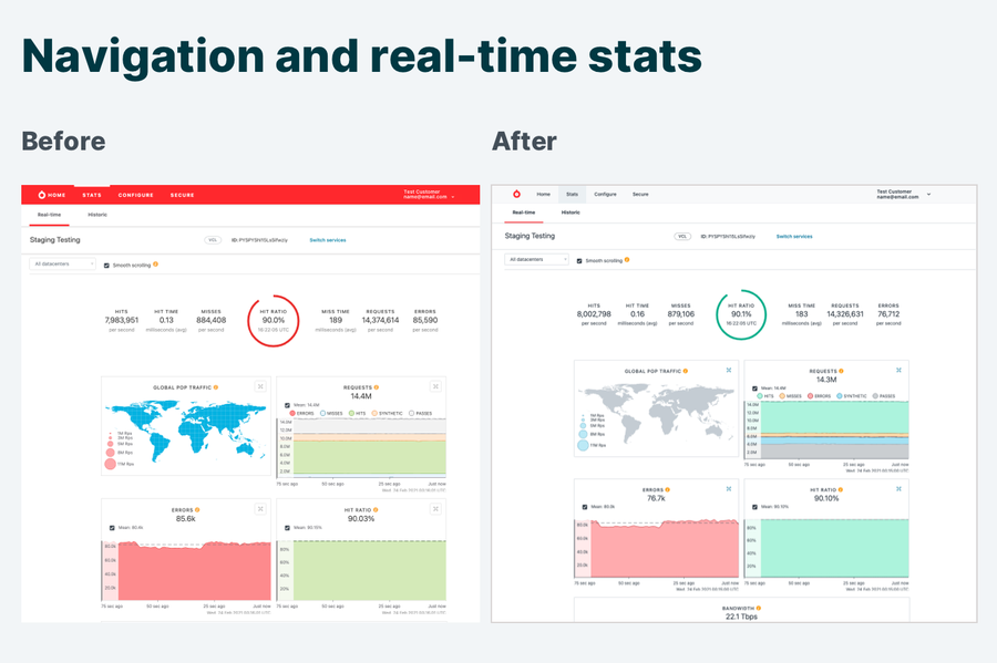
For the sign in screen, we swapped the red color field for a neutral grey and placed the text and input fields against a calming white background. The new colors selected for our navigation and sign in screens also meet the Web Content Accessibility Guidelines (WCAG) 2.1 AA color contrast requirements. Human eyes have cones that are sensitive to colors with long light wavelengths, such as red, orange and yellow. Red, as an interface color grabs attention. So, we reduced the visual weight of the primary navigation by replacing the red header with a light grey background and dark text. This approach also improves the contrast and legibility of the navigation text.
We don't want your brain doing gymnastics when you're inside the control panel, and color is a way we can help signal quickly what's going right — or wrong. So we’ve updated our stats screens to define patterns for color significance across the graphs (green is positive, red reflects errors). This approach makes it easier to get an at-a-glance impression of what's going on across your services.
And, since familiarity reduces your cognitive overhead, we want you to have a consistent brand experience whether you’re on our public website, at one of our conferences, or in our control panel. So we made some additional color modifications to reflect a common design language with our brand.
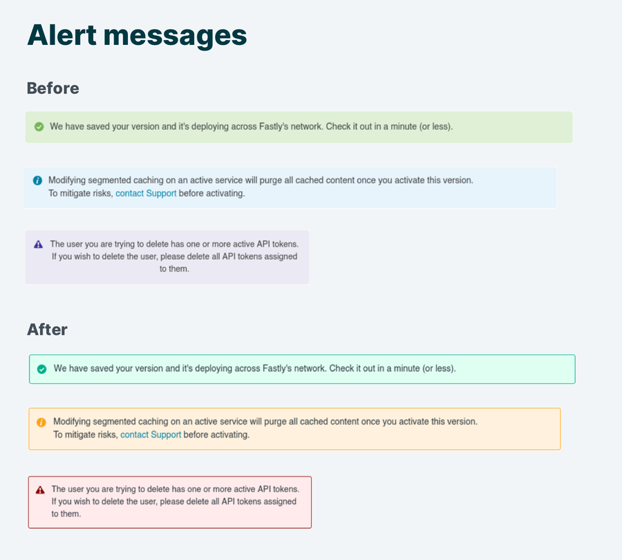
Finally, we launched new background colors with higher contrast text across our alert messages, buttons, and errors. We also deprecated the formerly purple error color, which was a divergence from the more common practice of using red-hued error colors. This makes it easier for you to quickly see that an error has occurred in the interface. Examples of our older alerts and newer message styles are below.
An ongoing effort
As Fastly grows, new challenges and questions are uncovered, and we’re constantly iterating, testing, and evaluating, looking for ways to improve. Head over to manage.fastly.com to check out the new interface, and feel free to submit any feedback to design@fastly.com — we look forward to hearing what you think!