

In July, we introduced the redesigned Fastly control panel, which our customers rely on to manage and control their Fastly services. As of November 17, 2016, it’ll be the first thing you see when you log in to manage.fastly.com. In the following post, the designers who worked on the new web interface discuss the thought process behind the redesign and highlight new features.
As UX designers, our goal is to make using the control panel the best experience possible; we help achieve this by fostering a culture of user empathy and design collaboration throughout our entire organization. This way, our product owners and engineers understand our customer needs and problems, and we can all work together with a common goal.
Design at Fastly is characterized by early, cross-team collaboration, which helps us maintain a balance of short-term problem solving and long-term vision, and empowers everyone to advocate for our users. In this post, we’ll discuss design at Fastly, illustrating with examples from the redesign of our new control panel.
Design at Fastly
As designers, we make sure we have a long-term strategy for our user interface. With a full product roadmap, it’s important to start with a vision and plan accordingly to ensure we’re delivering a positive user experience every step of the way. We can’t build everything all at once, so how do we prioritize what’s most important for a redesign?
Research
To help build an effective long-term strategy, we take advantage of several design and research methodologies:
Through customer interviews & anonymous surveys, we’re able to better understand who our core users are. Our customer research helps us to understand what their needs and expectations are when using the Fastly control panel.
Thorough research of ops tools helps us stay informed about what’s out there, so we know what industry expectations are.
We employ exercises such as design sprints and cross-company card sorting exercises to see how people think about the flows within the web interface. Individuals from marketing to back end engineering worked in small groups to sort cards and discuss why they thought certain features belonged together. This exercise helped surface areas of strong alignment, highlighted where there was the most contention, and reset overall assumptions.

These design exercises give us a deeper understanding of customer pain points and requirements, and achieve stakeholder consensus, helping us address the design problems we’re trying to solve now and in the future.
Avoiding assumptions
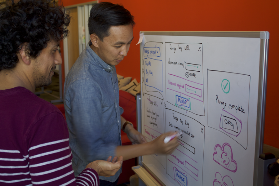
Making assumptions — no matter how much of a senior designer you are — is a common pitfall. As we refined designs, we used a tool called UserTesting to check if the flows made sense to ops engineers. Through rounds of usability testing, we were able to uncover and refine parts of the user flow that test participants found challenging. One such challenge was that new users were unclear on what we meant by the “health check” prompt on the screen. Based on feedback, we made adjustments to the image and copy to better describe our health checks, and added a link to “learn more.”

User advocacy
As designers, we need to build empathy and advocate for our users. It’s important that we understand the challenges our users face in their day-to-day work so that we can help them do their jobs more effectively. By talking to real customers and listening to their feedback, we’re able to identify major challenges that impact their ability to do their jobs. Armed with this feedback, we constructed and shared user personas and use cases with the UX engineering and product teams.
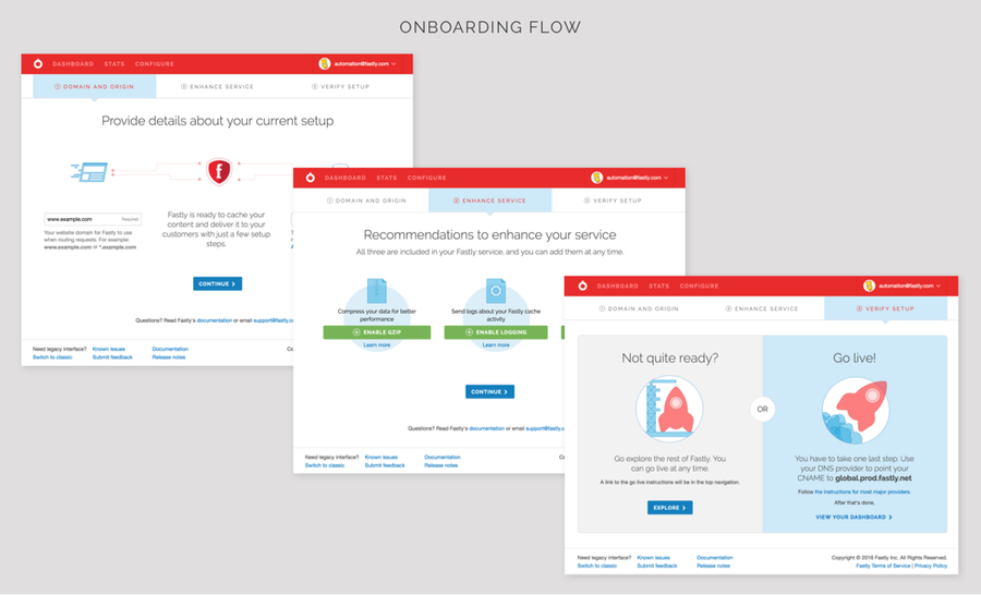
We also rely heavily on insights from our customer support team who work with our products more than any other type of user. Because they work closely with customers, they often notice patterns where customers get stuck and are the first to surface these trends. These discussions informed how we prioritized the recommendations screen for our onboarding flow:
The more people across our organization understand customer needs and expectations, the more empathetic we’ll be and the better products we’ll build.
Consistency
Whether you’re using our control panel or seeing our booth at a conference, you should always feel like you’re interacting with Fastly. A common pitfall in many organizations is that the UX team is functionally and physically siloed from the marketing team, leading to a product that feels very different from the website, documentation, emails, and other ways that customers interact with the company. To avoid this, we stay on the same page with our marketing team by having bi-weekly “design clubhouse” meetings where we agree on a consistent Fastly visual design language, give each other feedback on our projects in progress, and maintain a shared style guide with reusable interface systems. When redesigning Fastly.com and the updated control panel, we collaborated with marketing to create an overall consistent feel. In both cases, we expressed the Fastly brand through the use of common typography and a shared color palette:

Building the foundation
The work is never done; this iteration is the first step in evolving and building the foundation for the Fastly control panel. As more people start to use it, new challenges and questions are uncovered, and we’re constantly iterating, testing, and evaluating the initial designs, looking for ways to improve. Head over to manage.fastly.com to check out the new web interface, and feel free to submit any feedback to design@fastly.com — we look forward to hearing what you think!