
At Fastly, we always strive to do the right thing. That’s why we’re introducing a more accessible data visualization color palette as part of our Edge Observer product.
While we’ve made strides to improve readability and legibility across the application (you can read about dark mode or control panel here), one of the most challenging areas of visual accessibility that we needed to address is data visualization.
Why we updated our color palette
There are many benefits to overhauling our color palette:
Meeting Web Content Accessibility Guidelines (WCAG) for use of color in products
Differentiating the colors from one another
Expanding our customization capabilities
It is estimated around 8% of men and 0.5% of women have some form of color vision deficiency (color blindness). However, even those other visual impairments such as low vision or partial-sight can benefit from more distinct colors.
As a core feature of our built-in monitoring solution, our charts use color to differentiate data types and allow customers to understand the traffic passing through their services and respond when things are amiss. Therefore, it’s key that our users can quickly diagnose what’s going on and where.

Caption: An image of our current real-time stats page
Problems with color in data visualization
The primary focus of this redesign was the data visualizations color palette. Using different colors to represent different categories of data is an established pattern for graphs.
However, as the number of colors increases, there are more opportunities for colors to look similar to, and indistinguishable from, one another. While some charts on Fastly are simple, representing only a single data type, many more have multiple categories that can take even those without visual impairments more time to analyze.
Additionally, while the most common forms of color vision deficiency affect a person’s ability to distinguish between shades of red and green, there are multiple forms that affect other color pairs and can even inhibit one’s ability to perceive all colors.
Because of these factors, we needed to ensure that our default color order provides sufficient contrast between each color.
How we did it
We used a Figma plugin called Color Blind to simulate different color vision deficiencies with our existing color palette. With this tool we found that there were multiple instances where existing neighboring colors appeared very similar to each other for individuals with certain color vision deficiencies.
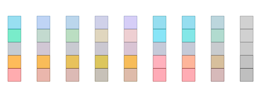
Caption: Our old 5-color palette simulated across 8 different types of color blindness
These analyses made it clear that we needed to address our color selection. Because we didn’t want to create a stark departure from our existing colors, we worked with our Brand team through multiple iterations to ensure that the colors did not depart too far from the Fastly brand while still increasing accessibility.
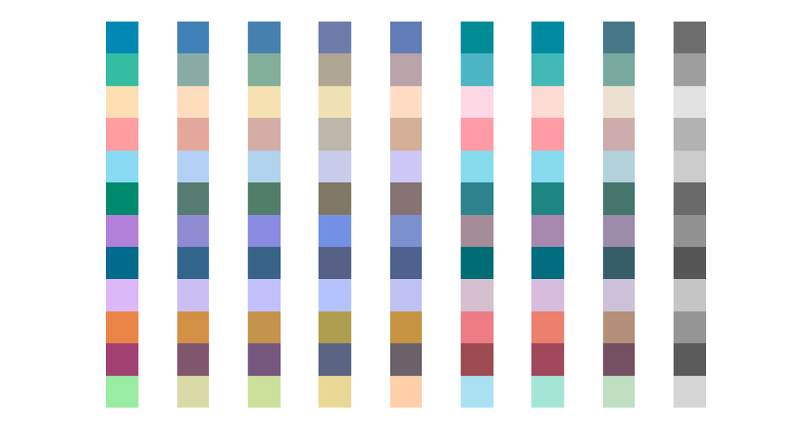
Caption: Our new 12-color palette simulated across 8 different types of color blindness
We opted to move away from using borders and fills, as the similar levels of saturation and brightness affected how easily colors were differentiated between each other. In addition, limiting colors for each category also reduced overhead for our design system.
Customization Improvements
In Edge Observer, users are able to create custom charts and dashboards to track key metrics. The refreshed color palette supplements Edge Observer’s customization capabilities by adding more unique colors. This means that customers are able to show more types of data on a single chart without repeating colors.
Future of accessibility and data visualization at Fastly
Improving accessibility in our products is an ongoing process. Our journey is not complete, and we are dedicated to creating experiences that are accessible from the start, rather than having to revisit them. We’re looking forward to sharing enhanced experiences for individuals who are screen readers or keyboard users soon.
Edge Observer Access
Edge Observer, with all its customization features and the accessible palette, is now in beta. Contact your CSE or account manager to learn more.
If you have any feedback on the new data visualization colors, please email us at design@fastly.com.