

You can measure almost everything about your code: performance, uptime, cost per request... the list goes on. But when it comes to energy use and carbon impact, many developers are flying blind. Fastly’s Green Coding Survey 2025 found that while 77% of developers actively consider sustainable code, more than half admit they lack the tools to know if their work actually makes a difference.
Fastly’s Sustainability dashboard solves that by tying emissions data directly to your Fastly workloads. With that visibility, you can finally make data-driven decisions about how to optimise for both performance and sustainability. Here are four practical ways to use it:
1. Track changes like you would a deploy
Gaining clarity on your carbon consumption is critical. The Fastly Sustainability dashboard delivers the data you need, offering clear charts on the real-world impact of your services.
To drill down to the impact of your Fastly Delivery and Compute services, you can focus on the “Electricity-related GHG Emissions” chart. To do this, you just select “Location-based” from the dropdown and toggle off the green “Scope 3 (Location-based)” box. That way the chart focuses on Scope 2 (location-based) emissions, which represents real-world emissions based upon the electricity consumption of your Fastly services.
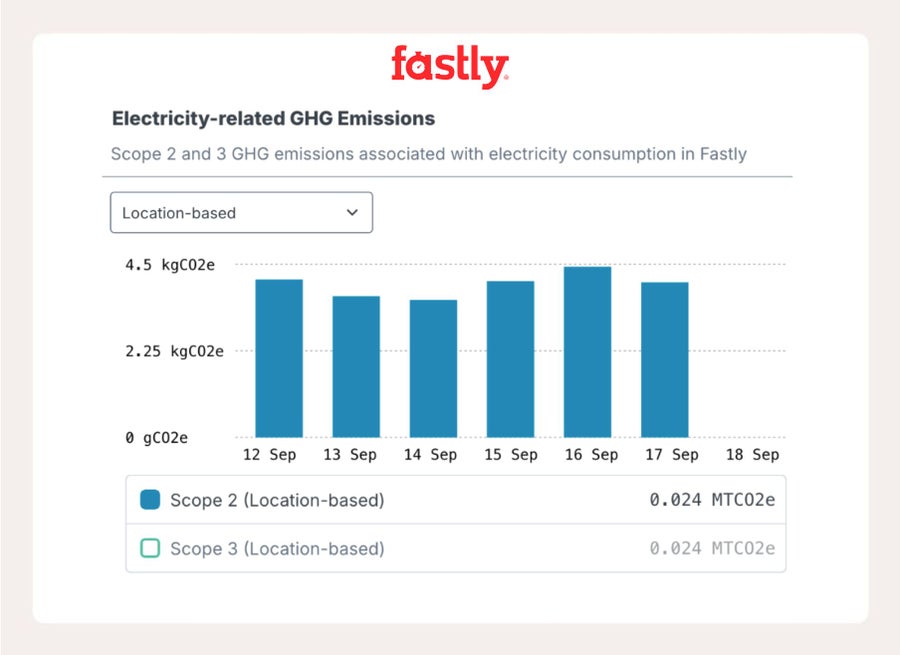
As we update our sustainability data daily, you can see the impact of changes in your use of Fastly.
2. Find out what’s really costing you
Upon first view of the sustainability dashboard, you can check the “Bandwidth” and “CPU Time” charts to see how your services use the resources.
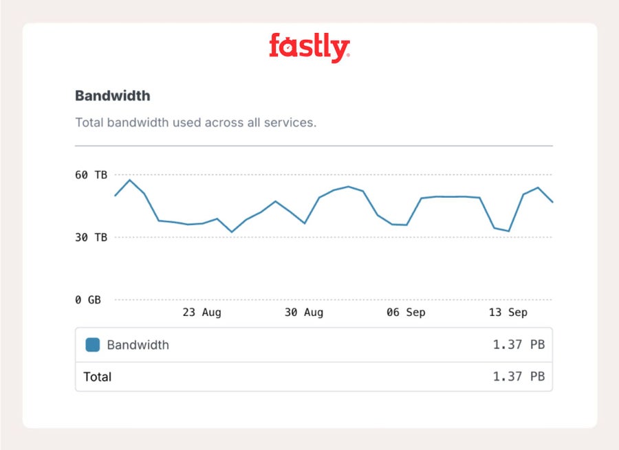
A spike in these charts might indicate a spike in traffic - use our account observability tools to see if this is the case.
If you can attribute changes to a single Fastly service, then use the service observability tools, which add vertical lines on charts to signify when a new version of a service was activated. That way you might be able to pinpoint performance problems tied to a new push. Armed with this knowledge, you can begin your investigation.
3. Don’t ignore geography
The dashboard charts aggregate data across all your Fastly services and every country. If you require country-level reporting, we provide access to the underlying raw data as a CSV export with a country- and product-level breakdown. You can delve into the data using your favourite data science tools.
With country-level views you can investigate where traffic is “dirtier.” If you’re leaning too hard on fossil-heavy regions, improve your caching strategy to shift load without slowing users down. You can also see the renewable coverage percentage to understand how much clean energy your workloads are actually riding on.
4. Automate it, like everything else
In addition to the CSV export, all the data is available via our Observability Timeseries API for Sustainability. That way, you can push the platform’s data directly into your internal observability pipeline.
No need to keep another dashboard tab open: hit the API, pull the data into Grafana or Datadog, and set alerts when emissions spike, just like you already do for latency or CPU.
Bonus tip: Sustainability and web performance are best buddies. Be aware of the Web Sustainability Guidelines. I highlighted my favourite guidelines in 5 tips for creating speedier, more sustainable websites with Fastly.